Deleted
The formatting is atrocious, and feels like the NVIDIA driver forums. The menu thing on the left needs to have a minimise function to make better use of screen space. On the plus side, the speed improvement is, frankly, mindboggling. It finally feels nice to move from forum to forum, and post to post, so a huge thank you for that.
2 Likes

How did you get rid of the side menu on the left?
1 Like
overwriting with own stuff
1 Like
Could you share that, by any chance? Just that one change would make a marked difference to the usability of this site.
yeah working on it… feels already better

but have to wait until they are finished with their stuff
its 2022 and they show up with 690px and 320px for sidenavs posts… grml
2 Likes
Maybe they’ll give you a job fixing this for them. I’d sooner use your version than theirs. I tried to have a go at fixing it myself, but I’m like a caveman using a smartphone when it comes to this stuff.
1 Like
I would very much love to use your version as well.
I have given this new format a good honest try, and I get that it’s new, but come on, just way to much wasted space (in particular the left column and the inclusion of the current user icons) at the expense of very little content per line and lots more scrolling.
As a coincidence, I just came back here from Facebook, and said “AH HA”. It looks to me like they tried to imitate FB too much.
1 Like
And while you are at it, it would be great if the background and text colors could be user selected?
I did a bit of HTML web design a good 10-12 years ago, but this is a bit (quite a bit actually) beyond me at this point. No use of css when I was doing this.
NB: I appreciate your working on this!
In fairness to the OP, I have seen quite a few “Welcome new user xxxx” or “Welcome Back user xxxx. First post in a year”.
As a side note, I would love to be able to disable that stuff. For me, it is just more clutter to scroll through
Is one of them for me by chance?
It appears more user friendly on phone
I didn’t happen to see your welcome back. ![]()
1 Like
This is much better than the old forum. Everything loads quickly, no more BBS speeds
1 Like
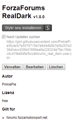
Install Stylish or other userstyle extension for your browser
Variant 1: RealDark (80% width)
Preview:
After extension is active click this link https://gist.github.com/PinkiePieStyle/b7e5576715e7e9d4db0b7e0b267e336d/raw/83f84c2b5b02df8cfeb0e8b5e5cb04634814431a/forzaforums_real_dark.user.css
in the opening window uncheck “search for updates” and press install
Variant 2: Light (80% width)
Preview:

https://gist.github.com/PinkiePieStyle/83bae947f6059069615c7965c0697465/raw/1db1cd508a24864f057880956c7fc04b4c301bc5/forzaforums_light.user.css
Original but 90% width
Preview:

https://gist.github.com/PinkiePieStyle/adb108fa9cf3d8fbddf77c2c50873fc4/raw/6bf91fe50736e735e236eef062f783833c874284/forzaforums_extwidth.user.css
Oh wow, an update to the forums, how long has it been! Was anyone else here around back in XBOX 360 days when this place use to be IT? Before Fakebook, Instagram and all of the other social media took over the internet and ruined the world? Just reading old posts that go back to FM5 gave me some serious nostalgia. The discussions and sharing and sometimes heated debates about tuning, good times! Hopefully when the NEW Forzamotosport is released it’ll give us something new to talk about, I still have hope for this franchise.
BTW, anyone know how or if it’s possible to view forums from FM 2, 3, and 4?
? you’re playing on xbox no way to fix something yourself
I don’t even know what programming language they use